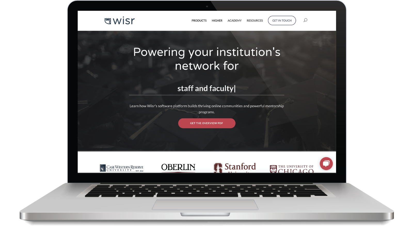
Wisr (pronounced wī-zur) builds networks for universities. After Wisr worked with NGageContent to build V1 of a marketing site, Wisr’s offerings expanded. Wisr initially focused on career prep but—a year later—was also assisting alumni teams, first-gen centers, and mentorship programs.
I redesigned and developed the site, aiming to articulate our full range of services and increase conversion.
Wisr (In-House)
HTML, CSS, JavaScript, WordPress, Sketch, Illustrator
John Knific (Project Manager)
Anna Moloney (Marketing Director)
NGageContent (Marketing Agency)
Few visitors to Wisr’s marketing site were browsing for more than a minute, and almost none were scheduling demos.
Internal Interviews
Data Analysis
Heat Mapping
Card Sorting
User Personas
Journey Mapping
I had about a year of Google Analytics data to guide my research. I noticed a pattern in which a visitor first moved from the home page to a page targeting a key segment, at the time either:
- Liberal arts institutions
- Faith-based institutions or
- Research institutions
Most of the visitors were then exiting those segmented pages within seconds. Follow-up interviews with our Customer Success team and several partner administrators revealed that most higher education professionals identify more strongly with their department than their institution type.

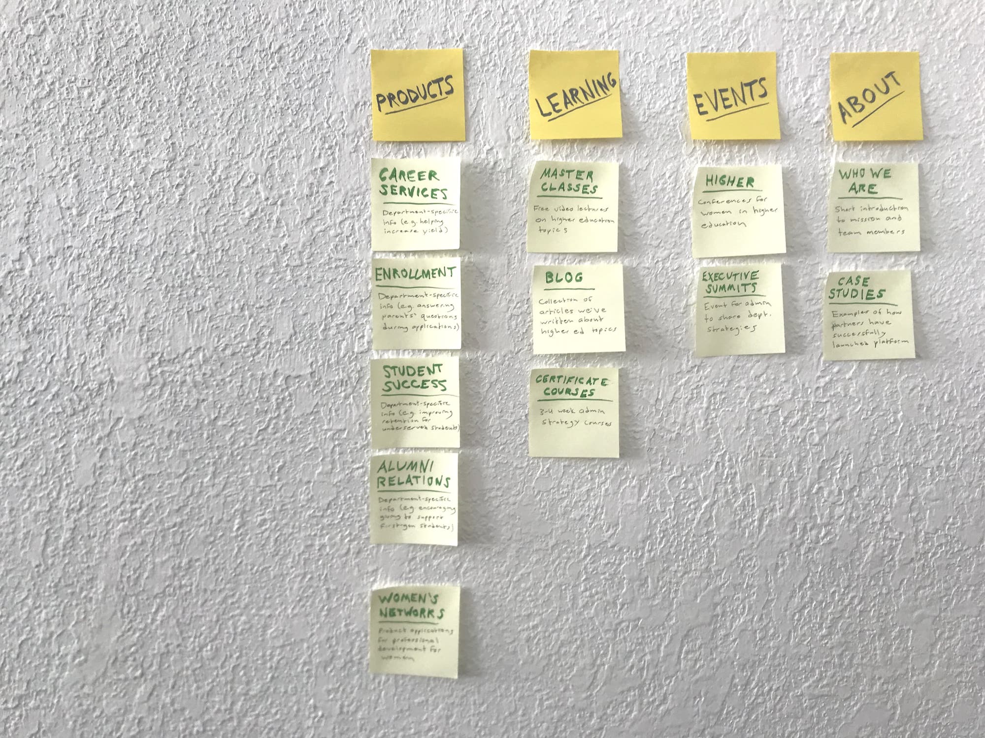
Updated departmental segments for site visitors
Even when segmented properly, potential customers rarely felt ready to schedule demos during their first few visits. One typical message we received read:
Hi, I am currently working for a school with an estimated 2000+ alumni in total with another 200+ current students. Before I dive into the details, is it possible to offer me an estimated price for the service? Thank you!
I ran a an A/B test comparing two possible calls-to-action:
- Schedule a product demo (the incumbent call-to-action)
- Request a detailed product PDF with pricing
The calls-to-action required visitors to fill out identical forms, but the PDF option was more than twice as popular. Visitors wanted more information—especially, I found, pricing—before agreeing to what they assumed would be a high-pressure conversation.
Next, I focused on clarifying navigation and had ten subjects card sort the site’s existing pages. Subjects placed cards representing web pages into categories and subcategories, an analog for the site’s information architecture.
Rounding out my research, I heat mapped the cursor behavior of about 10,000 site visitors to understand more granularly how site interactions were playing out.
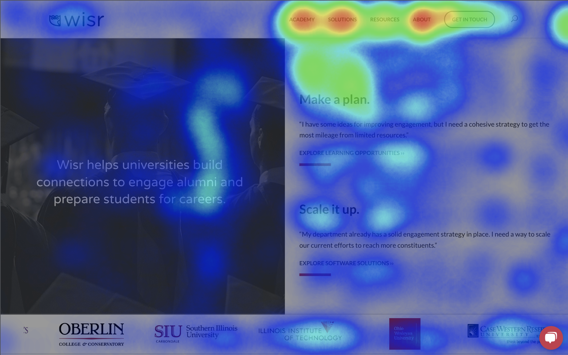
This heat map of a section of the home page showed that visitors were attempting to click static headings and didn’t understand how to use the site’s logo carousels (they required a click and drag).
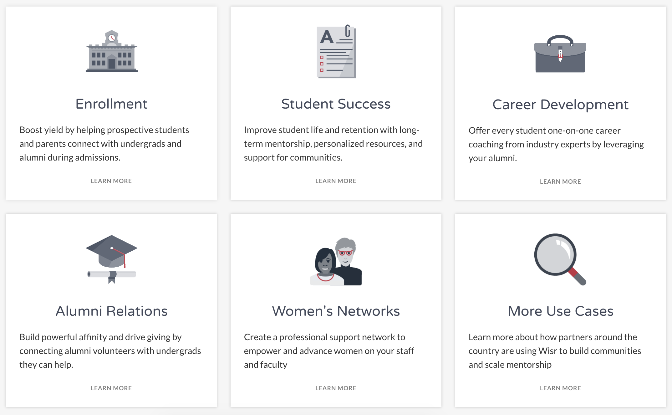
My redesign centered around updating our segmentation strategy, clarifying navigation, implementing a new call-to-action, and articulating new offerings.
I restructured the site to funnel visitors to specific content for their department or use case. Each visitor would see content relevant to their needs as quickly as possible.
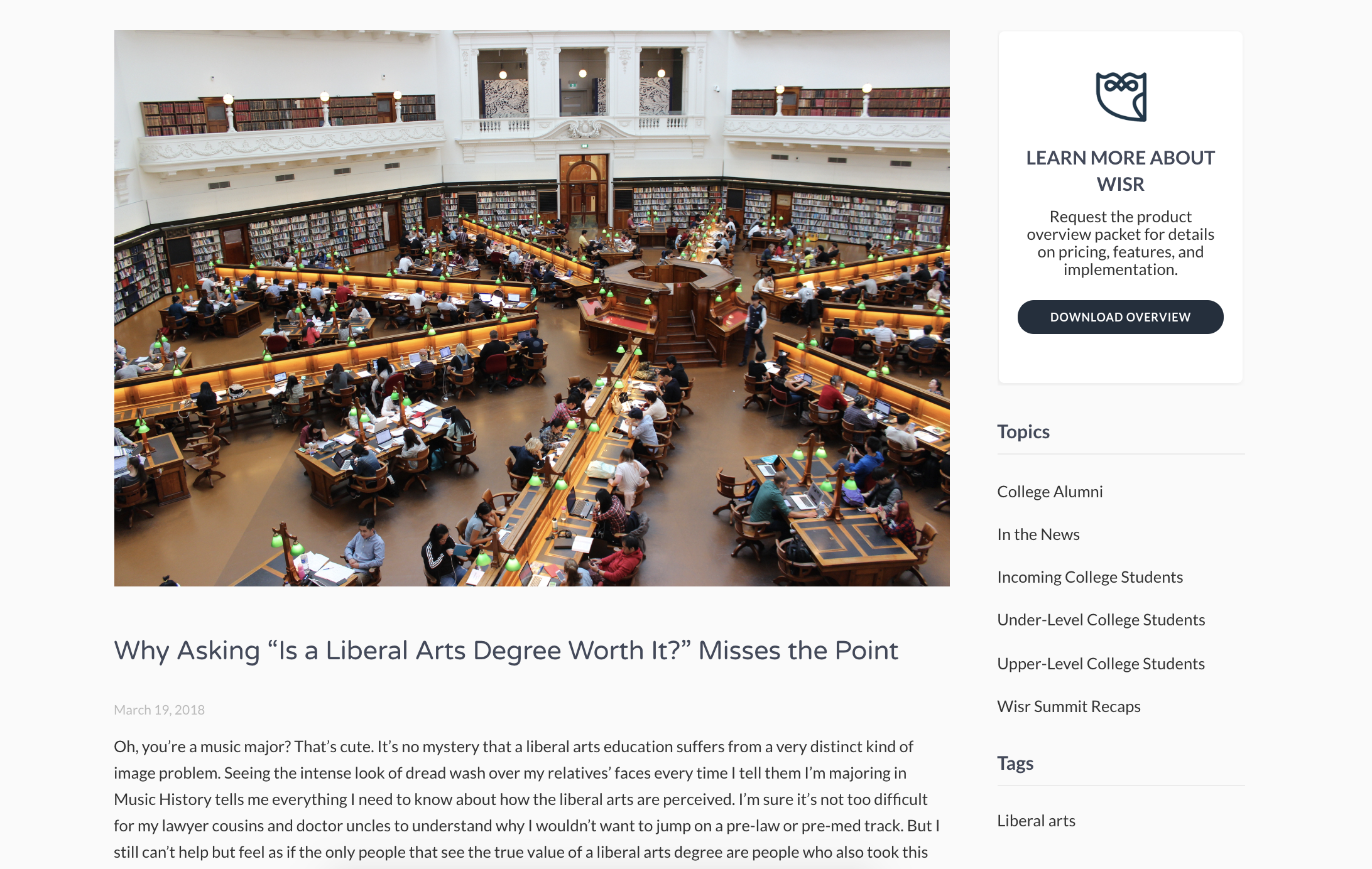
Blog posts were among the most visited pages on the site but weren’t designed for conversion. I modified the blog post template to add a call-to-action sidebar, ensuring that readers could easily learn more about the product.
Leveraging my findings from the card sorting and heat mapping research, I changed the Solutions heading to Products, highlighted the active navigation item, made headings into clickable links, and converted the logo carousels to responsive grids that exposed every item.
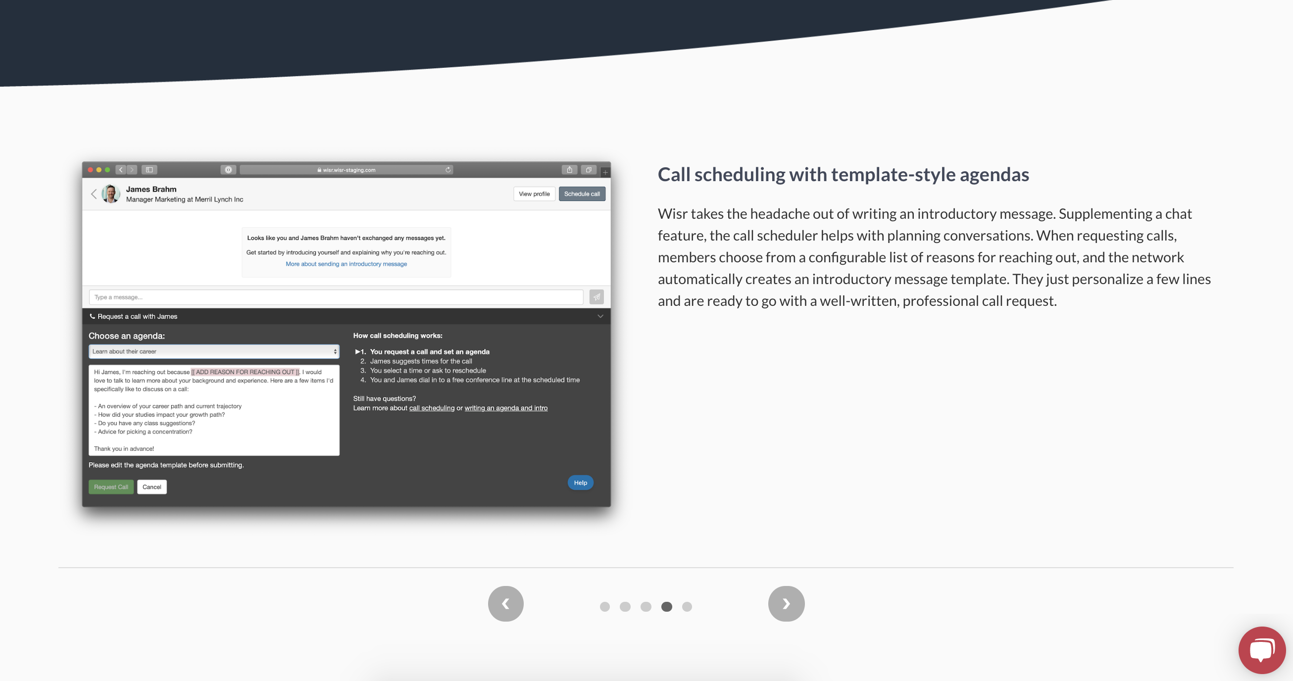
To help visitors understand the product more visually, I built a slider that pairs screenshots with explanations. The slider can highlight different features depending on its location. On the Career Services product page, for example, it includes slides explaining the industry explorer and alumni advisor search tools.
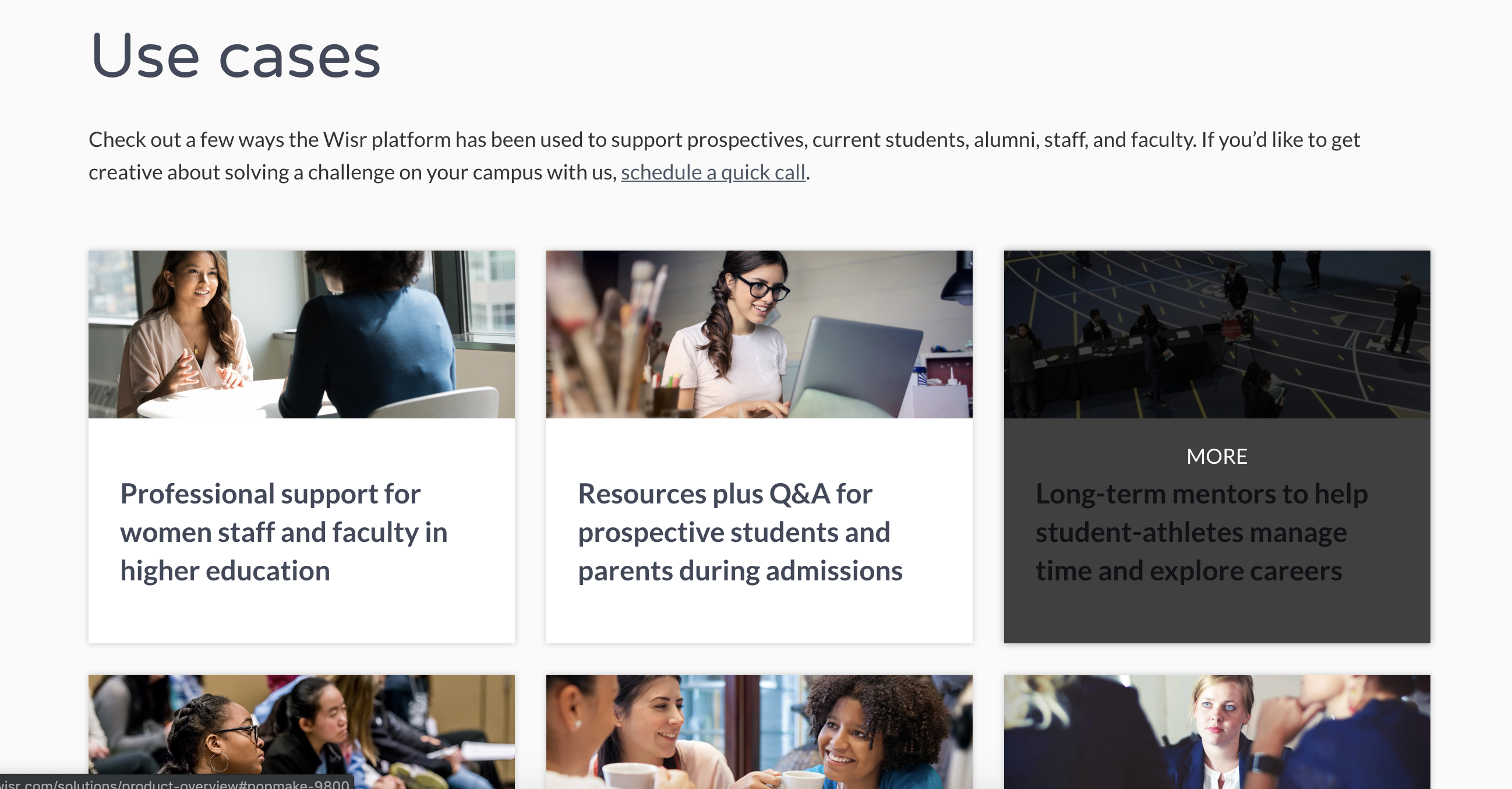
Throughout my work, I aimed to connect features to visitors’ pain points. I added a Use Cases page to give visitors some ideas for applications based on how existing partners were using Wisr’s technology
The updated site immediately began to impact Wisr’s bottom line. Within a month of release, the rate of inbound lead generation from the site had tripled, and—thanks to publishing additional product information—potential customers were better qualified by the time they entered conversations with the sales team.
Most importantly, customers seemed to have a much clearer idea of what our offerings were. A huge personal takeaway from the project was learning to present products in language that references the reader’s goals and pain points.